Swiffy Slider examples
Get inspiration from a number of responsive examples as seen in real websites.
Most examples are using Bootstrap 5 for slider content, but could be any markup and CSS.
Image carousel
Simple image carousel with even sized images
Image carousel
Simple image carousel with uneven sized images, ratios and lazy loading
This example uses .slider-item-ratio to make the images fill the slide. Set
object-fit: contain on the image to make the image scale within the slide box and
become fully visible
Indicators is in 2 versions - one for larger displays and one for small displays uising Bootstrap
respsonsive utilities. But shows how to use indicator options on the .slider-indicators
element directly
Stories
Combining grid, images and text content to create visual appealing content
Articles
Card based design with shadows using photos, description and button
Visual statements
Slides with no gap and different background colors to make statements stand out. Shows indicators outside on mobile only
News ticker
Autoplaying thin carousel with just text in different colors and sizes. Indicators moved using inline
style on the slider-indicators element
Logo band
Fixed height logos in a band with autoplay. Using ratios with custom ratio size. The swiffy-slider instance has padding and shadow to elevate the band. Navigation is always visible and placed outside the slide container
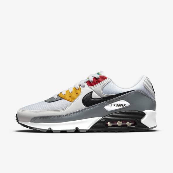
Product slider
Simple and neat product slider using product photos with a background color that is the design element
Product slider 2
Product slider revealing next product and emphasizing each product using shadows. Navigation is placed outside with expand so they flow outside the content area on larger displays
Product gallery
Show thumbs and navigate to large image and clicking large image will open dialog with slider. Using 3 sliders - one for thumbs, one for the product image and one inside the modal.
Uses Bootstrap modal, helpers and utilities, but the concept would be the same in other frameworks
This is to show the possibilities using sliders in different ways, same content and different context and layouts. JS is inline just to show the principle but should of course be optimized
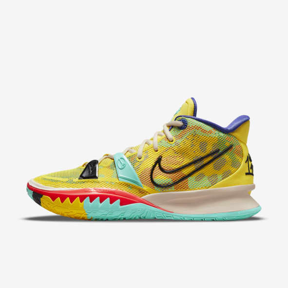
Nike ZoomX Invincible Run Flyknit
Get after those long runs with lightweight, responsive foam that delivers a soft feel with every step. A Flyknit upper gives your foot breathability where you need it most and secure fit you can depend on.
- Shown: Volt/Barely Volt/Black
- Style: CT2228-700
Going to the movies....
Full width section with background image with a gradient overlay. 3 slider instances in full width with 6 items per page.
Trending
Documentary
Just released
Image carousel with infinite sliding
Simple image carousel with 'infinite sliding'. Using a bit of scripting, this example will look like it has infinite scrolling by going to the first slide when the last has been reached. The trick is to repeat the first slide as the last and then use JS to go back to the first when the end is reached. This only works when showing one slide at a time and if used with reveal will cause jumping
Image carousel with animated text
Trick using the animation class to trigger that visible slides gets the
.slide-visible class and that is used to animate the text.
Full screen image carousel
An image slider put inside a modal (In this case a full screen Bootstrap modal).
Javascript is used to set focus on the first slide when the modal is opened and the slides have tabindex="-1 " to support keyboard navigation
Click the image to see the carousel in full width and navigate with keyboard arrows
(Press ESC to close fullscreen view - or tap the image)

RTL (Right to Left) carousel
Swiffy Slider fully supports right-to-left layouts. Add dir="rtl" to the
slider wrapper and navigation, indicators and mouse drag all work correctly in the RTL direction.


